NOONOO
Brand & Identity — LOGO Design — VISUAL COMMUNICATION — SIGNAGE
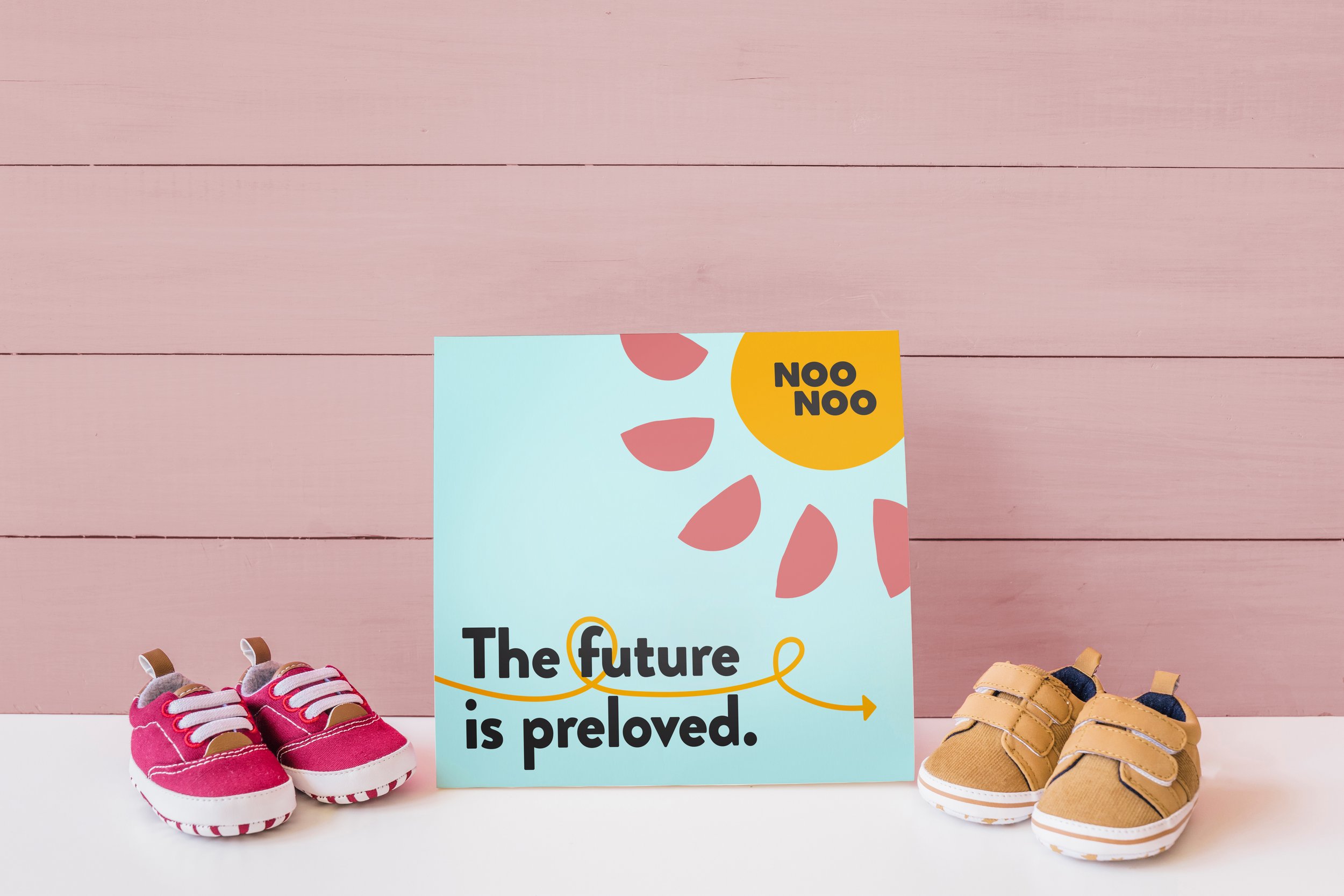
NooNoo is a curated secondhand clothing boutique for kids founded by two mothers who wanted a more eco-friendly way to shop locally for their families.
I was tasked to elevate and refresh the identity to prepare them prior to a move to a larger retail space. This included establishing a visual identity, signage, marketing tools, and promotional items.


a better future for our KIDS and the environment.


Design Approach
PROCESS
After engaging in discussions with the client and analyzing their previous brand identity, it was clear that a transformation was needed to create a vibrant and approachable new image for their new store. This involved incorporating elements such as a new logo, patterns, floral/natural motifs, an expanded color palette, and fresh fonts to appeal to both children and mothers while maintaining credibility.
Three design options were presented: the chosen look, an earthier palette alternative, and a sun-themed option. Refinements were made based on feedback, including adjustments to the color palette, introduction of movement and patterns, and infusion of childlike whimsy. Following this, a comprehensive collection of branding assets were developed, including brand guidelines, store signage, shopping bags, clothing tags, an a-frame sign, and social media templates. This approach ensured consistency and connection across various touchpoints, solidifying the brand's identity and enhancing engagement with its target audience.
OUTCOME
The recent store expansion saw a successful unveiling, showcasing the unified new identity throughout the space. The clients have enthusiastically embraced the fresh direction, marking a positive response to the revamped brand image.
Research & Development — Color — Typography — Communication — Time Management — Positivity — Conceptualization — Storytelling — Playfulness — Adaptability
